
Creating a brand for a ground-breaking health service
Our clients created a business aimed at simplifying the health journey of chronic disease patients. With the increasing technological penetration in the sector, the future of pharmacies and pharmacists is uncertain. There is a need to reinvent the business and its purpose.
One advantage of pharmacies is their capillarity in communities and their ability to reach all population segments, even those that might not be online. Another consideration is that chronic diseases will make up the majority of health conditions in the future, and pharmacies can become the central touchpoint for chronic illness patients to get personalized advice and guidance - prevention, diagnosis, medication, mental health support, notifications, and general follow-up. This kind of service - lead by Ezfy - can then provide valuable data to understand and innovate on managing chronic illnesses.
Ezfy motivation is to help their clients to navigate their health journey easier. Shortly they will incorporate restaurants, health centers, gyms inside their network to have a complete simplification of chronic disease journeys.
Our brief was to create a naming and brand that materialised the concept of a health journey made easy. We were also asked to create a logo that reflected the innovative and technological character of the business.
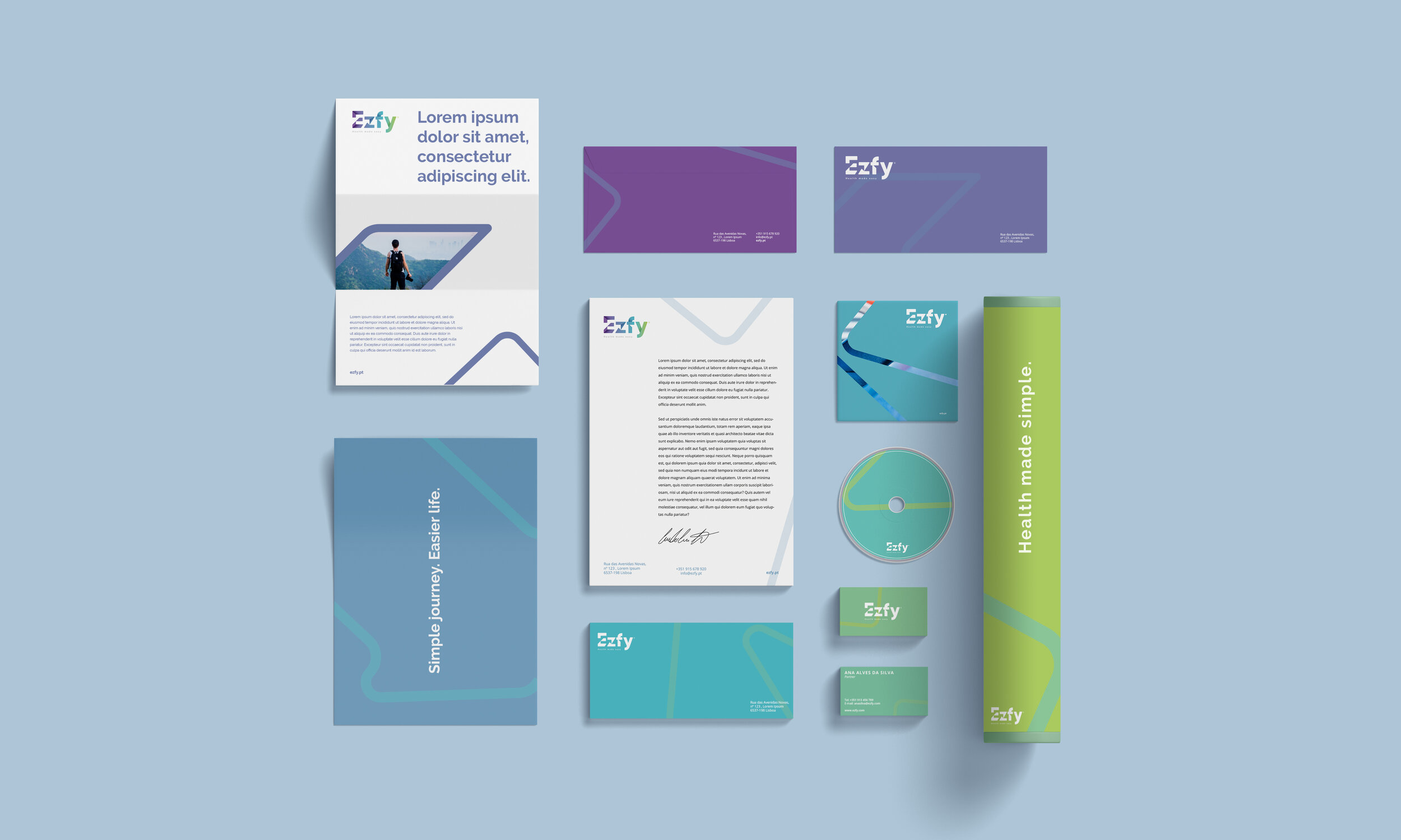
EZFY was our answer to the naming challenge. Short, concise and straight to the point, EZFY sums up everything about the brand. To reinforce its positioning we created the tagline “Health made easy and simple”.
To create the visual identity we had to stop and look around at what is happening in the pharmaceutical environment. EZFY is a brand that will live alongside many other health brands so it needed to answer two nearly-opposite goals: stand out from the crowd while simultaneously cohabiting harmoniously with all the other brands.
The result is a wordmark with letters that represent the simplification of one’s health journey. Starting with a fragmented “E”, transitioning discreetly through the “Z” and “F” into a smooth, rounded “Y”. The colourway is a gradient of all health-associated colours, starting from a darker purple and ending in an uplifting green. Together all these elements help EZFY communicate to patients that a chronic disease no longer needs to mean a complex life.


After launching last year, Ezfy is broadening its reach and simplifying life for patients with chronic illnesses of various natures. The business targets all major therapeutic areas and their respective health conditions and wanted to develop a brand ecosystem that reflected this.
We started by finding a logic to create differentiation. We thought of therapeutic areas as “continents” and of health conditions as “countries”. How do we organize continents and countries? In a map. In this case our map is the human body.


